Jira Dashboards for an Agile Project
Jira dashboards are a useful way to take a quick peak into a project to get a feel for their state and health. Think of them as an at-a-glance healthcheck.
There are a few useful gadgets/widgets that I use to answer a few important quetions. My most recent projects are using Scrum so this will be tailored for that flavour, but by tweaking a few charts and queries, you can apply them to any agile project.
The dashboard is a useful tool for gathering insights, but is not a replacement for standups or checkins.
Sprint health
A really insightful little widget that provides you with the current status of
the sprint.
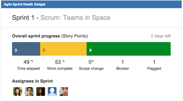
It includes
- The progress of tasks (not yet started, in progress, completed)
- Any scope change
- Any blockers or flagged issues
- Remaining effort to complete the sprint
- Time remaining in the sprint
- Assignees
Large storypoints
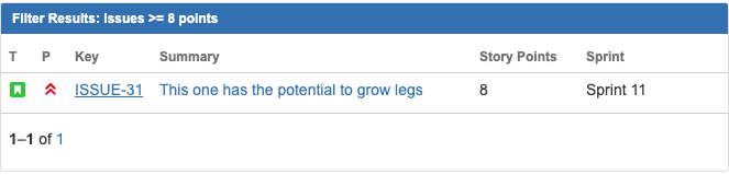
I like to flag tasks that have been assigned a high number of storypoints. High
estimates can be an early sign for tasks that i) can grow more than
expected or ii) may not be well enough defined.
To keep an eye on these types of tasks, I create a JQL filter that
queries on storypoints, and then I use the Filter Results widget to display them.
Create a JQL filter that includes a query on point count.
sprint in openSprints() AND "Story Points" >= n
Adjust n as you see fit
Next, add the Filter Results widget and choose your filter. This will run the underlying query and pass the results to the widget.
Assignees with a lot of issues
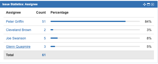
Depending on your workflow, this may or may not be helpful, but this next widget is helpful to see if someone on the team has a lot of assigned tasks, which could lead to a bottleneck if they became ill or needed to be redeployed to a different project.
Create a filter for active sprint issues and pass that to the Issue Statistics widget. Sort by descending.
Here’s an extreme example, but it highlights that Peter Griffin has the bulk of the workfload assigned to him.
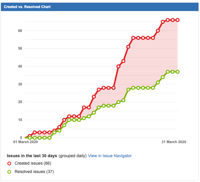
Created vs Resolved
Is your backlog growing faster than you’re shipping?
The Created vs Resolved chart is a quick way to answer that question.
Sprint burndown
The burndown chart is a quick visualisation of work remaining in the sprint and a way of forecasting the likelhood of achieving the goal. It is based on points and time remaining, taking into account non working days.
Here’s one I pinched from Atlassian.
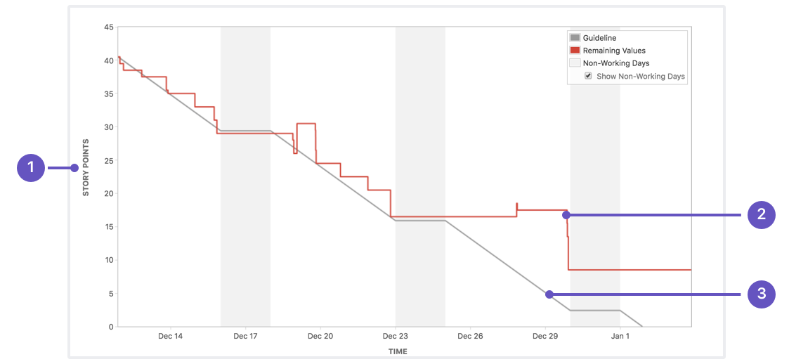
- The total number of points is shown on the y axis
- The points remaining to be completed.
- The guideline (think of a glideslope for an aircraft)
Fairly self explanatory but it’s one that I like to have close to hand.
Other useful widgets
Keep your dashboards neat and minimal, but here’s some other widgets that can be helpful too.
- Activity Stream
- Resolution Time
- Issue Statistics by Type